Resources

Case Study: Riding the Coattails of Conspiracy

A man in a short-sleeved plaid shirt and carrying a backpack looks at the camera.
Tim Tangherlini

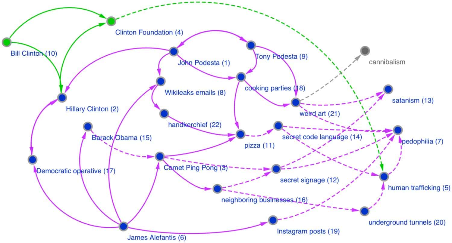
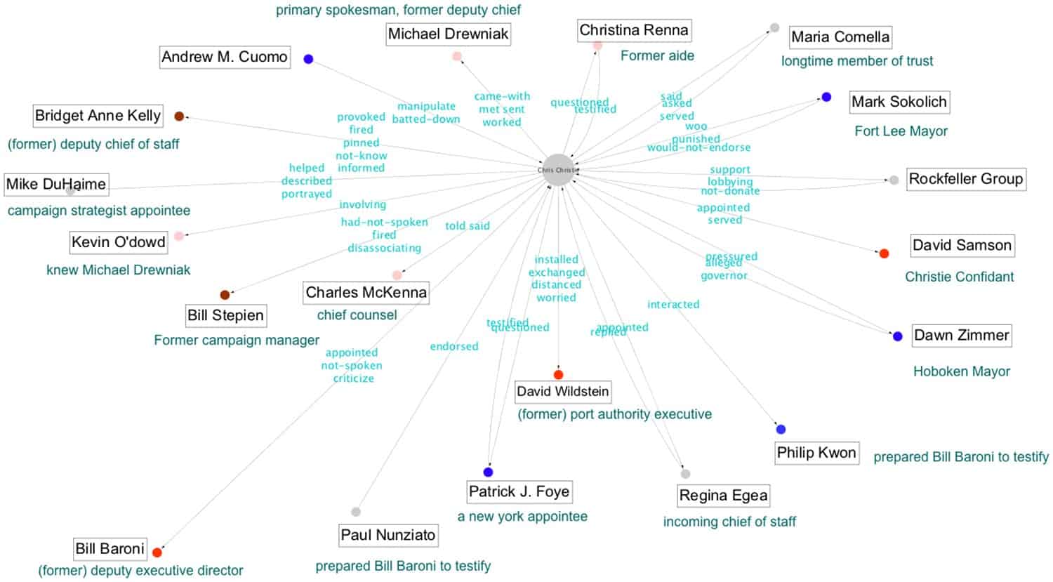
In 2020, folklorist Tim Tangherlini and his collaborators published an article on how narrative frameworks could help people distinguish between conspiracy theories and real conspiracies. Within months, his research was being written about and talked about by the BBC, Ars Technica, Axios, the Conversation, and NPR’s “Science Friday,” to name just a few. How did he get so much national coverage? Tim likens it to surfing: being in the right spot at the right time to ride the wave all the way in.

But his success was also built on groundwork begun much earlier. In this 7-min video (below), Tim Tangherlini talks about what he did to get his research out into the public eye. As an academic folklorist in a university setting, Tim established a strong and collaborative relationship with the staff of the press office at his school. Whenever they needed someone to speak about a folk tradition such as an upcoming holiday, he always made sure to say yes. He also made sure to keep them apprised of his current research in case they identified any useful media connections. When he had research that he thought would have general appeal, he approached these folks and pitched his idea. Because he established a strong relationship with them, they were much more amenable to helping him promote his work. In this video, Tim also discusses the importance of preparing a brief, jargon-free explanation of your work, and seeking opportunities to collaborate and present across fields to encourage the sharing of ideas and research in ways that can be understood by general audiences.

A graph illustrating relationships between ideas in which ideas are represented by dots and relationships are created by lines and arrows connecting the dots.
Fig 6. Comparison of the research team’s results with the NY Times Pizzagate hand-drawn graph. “Edges and nodes that we do not discover in the top ranked actants through the pipeline are greyed out (cannibalism). Highly ranked edges and nodes that we discover not included in the NY Times illustration are in green (Bill Clinton and Clinton Foundation). We maintain the visual convention of dashed lines that the NY Times uses to identify relationships based on the interpretation by the conspiracy theorists of hidden knowledge. Immediately following the node label is the ranking of the actant as discovered by our pipeline.”
A graph illustrating relationships between ideas in which ideas are represented by dots and relationships are created by lines and arrows connecting the dots.
Fig 16. Comparison of relationship labels generated by the research team’s automated methodology with the NY Times Bridgegate graph for Chris Christie. “Most significant relationship labels from the “Chris Christie” node to other nodes are displayed here. For each node, we also include one descriptive phrase that was found in an automated manner by our pipeline. These descriptive phrases match very closely the roles portrayed in the NY Times Bridgegate graph. As in other figures, the edge labels only pick the most important verbs for the associated relationship phrase. The rest of the words in the corresponding phrases provide the necessary context for meaningful interpretations of these verbs. For example, the verb“pinned” connecting Christie to Anne Bridgett Kelly, is part of the phrase, “pinned the blame on,” which we extracted from the text.”

Back to Toolkit

Despite our best efforts, we do sometimes make mistakes and are happy to correct any errors that you may come across on our site. Should you find an error, please submit one via the “submit a correction” link.

  • This field is for validation purposes and should be left unchanged.

Share your resources

Have a resource you think might be helpful to your fellow folklorists or cultural workers? Share it with us